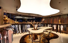
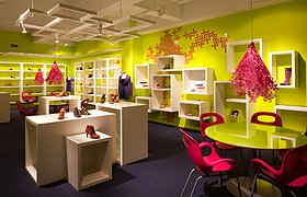
The request of the employer was defined as the formation of store concept, which will reflect the trademark identity of Vigoss, which is a well-known denim trademark in Russia. The employer also notified that the warehouse floor in Vigoss Textile factory in İkitelli had to be opened to visitors to show the products of previous season and therefore the warehouse floor had to be arranged as well as a concurrent subject matter of project.
While the abovementioned warehouse floor arrangement project criteria are questioned concurrently with the concept store design process, the "visitor profile" analysis of this floor showed that the two projects could be combined. Because, the store owners abroad, who come to the factory to choose products from the warehouse floor, were also the dealers, who will apply the architectural corporate identity to be determined in their stores.
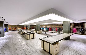
The idea of combination of these two projects, was adopted by the employer as an optimized solution. The new store concept, which will be included in the arrangement in the warehouse floor, will both constitute three-dimensional model application of design and could also be used as a showroom, where the season products may be shown to dealers. Also the dealers may see the season products, arranged in a single space by differentiating in the showroom and pre-season products in the warehouse floor, arranged outside of the showroom.
For these two functions, requiring different arrangement, space within space concept was adopted. While the entire floor with a space of 1000 m² was arranged as warehouse space, a 200 m² a demo-store-showroom was placed. The walls, constituting the limits of the warehouse area, was formed by stacking the associated boxes within the work of its own dynamics. The limits of the showroom are identified with transparent-opaque walls, designed to allow the application of different components, constituting composition in different formats. This space in space design was planned to be senses on first entry to floor. In order to reflect the position of the example store, as a street store, the space in front of the store, was designed to create the perception of street with abstract trees and benches, used as urban furniture.
The design of the store concept is built on flexibility. Tile cladding, leaving all mechanical-electrical infrastructure in the roof bare, was designed as a main skeleton where different modules of all illumination boxes of various sizes, adapted for different product exhibitions, are suspended. Within the work of the main design, adapted according to the physical conditions of each store, the modules, which may differ according to the number and varieties of exhibited products, were further varied after the commencement of use with the illumination boxes, which may be changed according to the selected module system. The perception of all components, suspended to ceiling construction as flying-light s; therefore, the products were emphasized and with the selection of color and material, an enduring sense of space was tried to be created.


